Indiana County

Market Data Analysis: Declining Markets

decline.jpg

Telling someone that their house has lost value won’t make many friends, but it will distinguish you as a real estate professional if you can analyze a market and be honest. The national news has talked about housing prices increasing yearly for nearly a decade now, and some areas of greater Pittsburgh has matched those trends at some times, others have remained flat, and others have declined. Today we look at some declining markets, and how to use simple tools to visually determine if there is a decline, and at what rate.

The above is the national median sales price trend since 1990 vs. the builder cost trend. We can see the slow down in real estate around 1990, the decline of 2008 some possible trends emerging now. However, the first thing that we should note is tha…

The above is the national median sales price trend since 1990 vs. the builder cost trend. We can see the slow down in real estate around 1990, the decline of 2008 some possible trends emerging now. However, the first thing that we should note is that VERY FEW areas in the greater Pittsburgh area have seen increases this aggressive. SO, before any seller says, “I bought my house 3 years ago, and houses have gone up nationwide by 3% per year… so my house is worth 9% more?”

The above are homes that are from across Indiana County that are of a higher quality construction. This is not merely a limit of, for example $200,000 and above (limiting a data search by a hard number like that will skew the results of the analysis…

The above are homes that are from across Indiana County that are of a higher quality construction. This is not merely a limit of, for example $200,000 and above (limiting a data search by a hard number like that will skew the results of the analysis). In appraisal language, these properties are all Q2-3 homes (For the definition: http://www.bradfordsoftware.com/uad/UAD_Glossary.pdf)).

Over the last 3 years (after a reassessment in Indiana County that sparked a spike in selling, and reduction in property values) the above data points represent the higher quality sales across the county. Once selected, these sales (with sale date, sale price, and original sales price) were placed in an Excel Spreadsheet. The data points were then graphed and a trend line calculated for each using the tools within Excel. We observe a few things above:

  1. There is a clear convergence of the scatter plot around a downward trend (with the exception of a few recent sales. Those two sales were some of the largest properties in the analysis, and one of them sold 23% below the original list price and stayed on the market for 2 years).

  2. The trend line indicates a median decline of $19.45 per day. When calculated with the median sales price of $325,500 this comes out to an annual decline of 2.18% per year among these homes. This is then a starting point from which we can refine the decline - however, this is a great starting point from which to make sure we’re taking a possible declining market into consideration.

  3. From other analysis of Indiana County as a whole, we’ve seen that some of the hardest-hit areas “may” be finding a bottom. There is the possibility that those recent high sales will result in a similar possible turn OR those recent lower sales would indicate that the decline continues. In six months, we’ll know for sure what is happening right now.

That is perhaps the most frustrating part of market analysis. Its always rear looking. While our “gut” might tell us that the market is “hot,” data is needed to be a professional. Look at the above graph one last time. The original list price trend is falling at 3.98%, 180% faster than sales prices. Why? Because sellers and their agents were way off 3 years ago, and are only recently starting to get to close to realistic sales prices. Our gut is susceptible to “confirmation bias,” in this case, the desire to see a stronger market than what really exists.

Do yourself a favor,

  1. Run the data on your market areas on at least an annual basis to stay on top of what the markets are really doing.

  2. Read our county reports that we distribute throughout the year for wider trends.

  3. Stay abreast of the national market data, but don’t put too much weight on it.

2019: 1st Third Analysis

data analysis as a service.png

As we enter 2019, with a slowing national housing market, trade wars, erratic stock market, tensions in the south pacific and in the gulf, and yield curve inversions, it's hard to see past the forest of new information. We want to provide you with basic countywide market trends and analysis to help you be better informed.

Why a third and not a quarter? Many of the markets that we cover in this report have limited data, which makes analysis difficult, yet we wanted to be able to provide some level of seasonal analysis. Quarter’s would be ideal, however, by extending the data to four months instead of three we gain 33% more data, and therefore more able to make reliable statements. It's odd, we know, but hopefully you find it helpful.

A note to begin: None of the above are singular market areas. In the two leftmost graphs are whole counties. They are placed together only because they have somewhat similar price ranges. Each of these areas has dozens of markets within them, and to represent the county trend as the market trend would be foolish. On every report that we produce we analyze the micro market of the subject and the surrounding competing markets when needed. However, to do this for a blog like this, would be to time intensive.

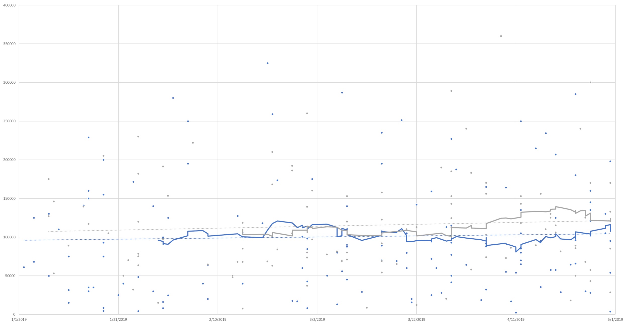
First up, let's look at Armstrong and Indiana Counties above (Armstrong: Blue / Indiana: Grey / 30 Day moving averages). These are both rural counties with some pockets of built-up areas (Indiana Borough, Kittanning, Homer City, Blairsville, Ford City, etc). Armstrong County as a whole has experienced typical seasonality, with a lower number of homes in the winter selling for slightly lower than the median prices would typically indicate, and a rebound towards the mean as we move into the late spring and the market begins to heat up. Indiana County, however, continues to struggle with low demand and a faltering median home price. While Indiana began to redound from typical seasonality, the month of April saw yet another decline. This is consistent with a now 2-year decline in home values in Indiana County. Leading this trend are the rural areas of the county, however, even White Township (the area just outside of Indiana Borough) has even recently begun to show signs of decline. Homer-Center School District is showing declines of as much as 7.5% per year, however, even the higher end homes of White Township are now showing a decline of 1.5% per year. Listing prices in Indiana County have begun to be in step with this (whereas a year ago they were increasing as prices were falling) however the degree to which listing prices are decreasing is lagging market prices similar to before. Overall, Armstrong County has a generally stable market, while Indiana County has weakening marketability (in part due to the past reassessment, more recent job closures, the declining population of IUP). While White Township had previously appeared to be resistant to this decline, it now appears to be moving with the county overall. It is possible that in the next year this trend could spill into the one area that has been resistant to the trend thus far: Indiana Borough.

In the year ending April 30, 2019, there were 451 sales in Armstrong County, while there are 227 homes currently on the market (Absorption rate of .166), indicative of a balance for the county which would likely indicate a continuing stable market. In the year ending April 30, 2019, there were 441 sales in Indiana County, while there are 384 homes currently on the market (Absorption rate of .096), indicative of an oversupply for the county which could continue to put downward pressure on home prices.

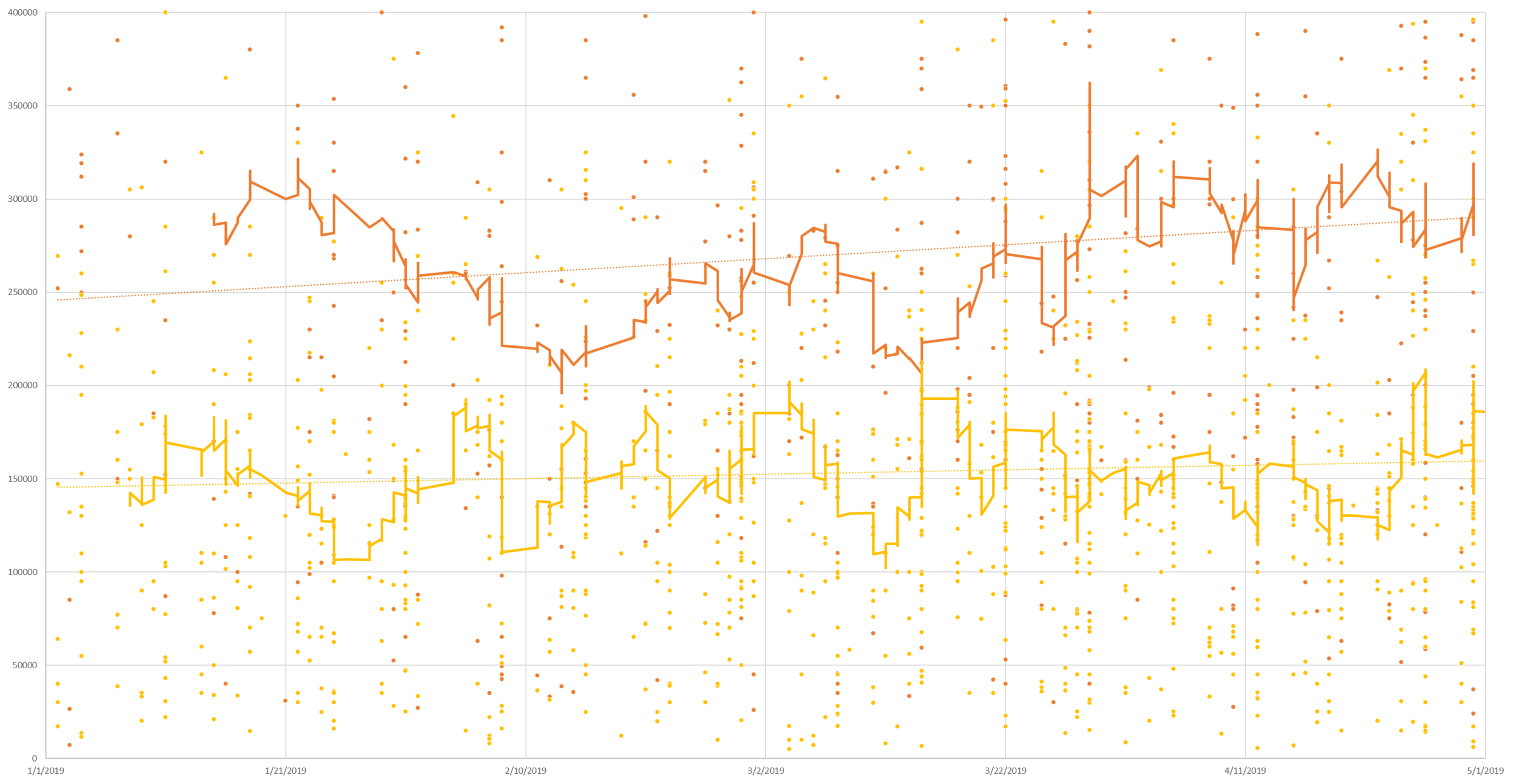
Next up, Butler and Westmoreland County above (Butler: Orange / Westmoreland: Yellow / 30 Day moving averages). These counties have mixtures of rural (Derry Twp and Karns City area for example) as well as very dense population centers nearer to the city (Cranberry Twp and Murrysville - not saying these are comparable, just having some similarity of density. Cranberry has experienced rapid growth in the last 15 years, which is in part reason for the higher sales prices) with wide ranges of appeal between them. Again, both are moving higher after seasonal softening in the winter months, however, Butler County with more sales is advancing more rapidly. Butler County has moved in a relatively steady direction from the winter lows, however, Westmoreland County appears to have had a week late March into early April. Reasons for this trend in relation to their neighbor Butler aren’t immediately apparent, but it is worth observing.

In the year ending April 30, 2019, there were 2,131 sales in Butler County, while there are 1,038 homes currently on the market (absorption rate of .171), indicative of a market in balance. In the year ending April 30, 2019, there were 3,768 sales in Westmoreland County, while there are 1,729 homes currently on the market (absorption rate of .182), indicative of a market in balance, or with a very slight undersupply.

Finally, the right two graphs are the 5 divisions of Allegheny County. These areas are highly complex, with massive differences in market areas even within these five divisions. Here we’ll offer the Absorption rate and linear regression analysis for the year ending on April 30, 2019, with current market data for listings.

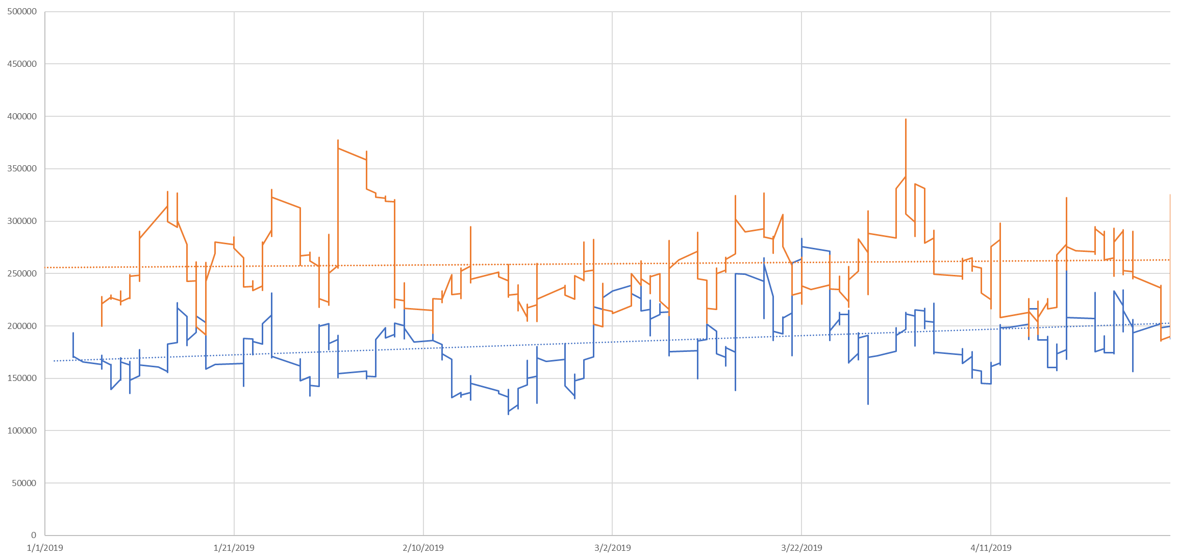
Allegheny East (Dark blue line above) had 4,289 sales in the last year with a total of 2,050 properties currently on the market (Absorption rate of .174), indicating that supply and demand are in balance. It started as the second highest median sales price area and ended the third highest. This was the third fastest growing area of the five for that time period.

Allegheny North (Orange line above) had 4,246 sales in the last year with a total of 1,687 properties currently on the market (Absorption rate of .210), indicating that there may be an undersupply. This started and ended the first four months with the highest median sale price and had the slowest appreciation of the five areas.

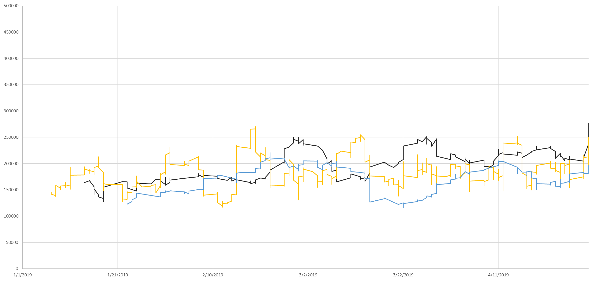
Allegheny Northwest (Black line above) had 1,259 sales in the last year with a total of 472 properties currently on the market (Absorption rate of .222), indicating that there may be an undersupply. It started as the 4th highest median sales price of the four and ended the first four months as the second highest median sales price. This was the fastest growing median sales price of the five areas for the first four months of this year.

Allegheny South (Yellow line above) had 4,264 sales in the last year with a total of 1,492 properties currently on the market (Absorption rate of .238), indicating that there may be an undersupply. It started as the third highest median sales price area and ended the fourth highest. This was the fourth fastest growing area of the five for that time period.

Allegheny West (Light blue line above) had 937 sales in the last year with a total of 330 properties currently on the market (Absorption rate of .237), indicating that there may be an undersupply. This started and ended the first four months with the lowest median sales prices. This was the second fastest appreciating market over this period.

This data is isolated to the first four months of the year, coming off of the lows of mid-winter. Attempting to extrapolate this to an annual trend would result in enormous errors. Every one of the above areas for the year ending on April 30, 2019, …

This data is isolated to the first four months of the year, coming off of the lows of mid-winter. Attempting to extrapolate this to an annual trend would result in enormous errors. Every one of the above areas for the year ending on April 30, 2019, experienced declining median sales prices and an increase in DOM over that time. The increases of the last 4 months have largely been seasonal, and in all cases have not corrected for the decline of 2018 (gray bars). Absorption rates above .20 traditionally indicate a sellers market, while absorption rates below .15 tend to indicate a buyers market. As you can see, Indiana is firmly in buyers market territory, while all but Allegheny East , in Allegheny County are in various states of buyers markets.

Why the decline? On the macro scale: Days On Market trending upward would indicate that homes on the market are higher than the buyer pool has a tolerance for generally - and that isn’t just a Pittsburgh issue, that was the story of the real estate market across the United States in 2018. The new generation (Millennials) coming into the home ownership age bracket has more debt than any generation before due to climbing education costs and falling wages when adjusted for inflation. Paired with the fact that the Baby Boomers are rapidly approaching the median life expectancy (2025), unless something unforeseen changes, this will likely mean a few years of slower than typical growth - or possible decline, as demand stays lower than typical and supply increases. Climbing interest rates in Q4 additionally put downward pressure on the real estate market across the US. Current forecasts indicate an increase of .25% over the summer off of their current 14 month low (note: an increase of .50% in the fall was paired with one of the slowest real estate markets in a decade).

On the micro scale: We expressed the reasons we believe for Indiana County above. The remaining counties have higher proximity to Pittsburgh and late 2018 saw the finalizing of the Amazon plans to build elsewhere, this may have deflated a small speculation bubble around hopes of development. We’re hopeful that a new distribution facility in Indiana County will provide some relief to the market. We also realize that there are very HOT markets in the midst of some of these declines, however, this is a bird's eye view of the region. Our area continues to move forward, navigating the transition from old industrial towns to what we are becoming. Leadership, investment, job opportunities, and creative thinking will be necessary to be successful.

Disclaimer: These graphs and analysis are based on all data available in these markets, REO, estate sales, distressed sales, and others. Micro-market trends can have huge impacts on prices, and these trends should not be extrapolated to all markets within these counties. Appraisals take as primary the immediate market area of those subject properties, and analyze differences of marketability that can change over the course of a tenth of a mile - much more those than can change from one end of a county to another.

Fun Fact: What are those hard vertical lines? Those are agents not doing closings on weekends (pushing extra data into the other 5 days, and gaps appearing weekly around weekends - good for you guys keeping your families first in the real estate race!